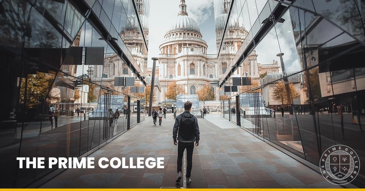
The new Prime College identity: a clean seal and confident wordmark.
At RB Creative Digital, we understand that a strong brand is the cornerstone of effective marketing and communication. When we began working with Prime College, we saw an opportunity to elevate their presence and align their visual identity with their future aspirations.
TL;DR: We rebranded Prime College to modernize their outdated logo and align it with their future goals. Inspired by prestigious institutions like Oxford, the new design reflects tradition and excellence with a contemporary, versatile look. The rebranding included a domain change, a new color palette and a simplified, symmetrical logo. The result is a cohesive and timeless visual identity that strengthens the college's market presence and resonates with both current and future students.
The challenge
Prime College's existing branding was outdated, with a logo and color scheme that did not reflect the institution's evolving vision. To position the brand more effectively in a competitive market, we suggested a comprehensive rebranding initiative.
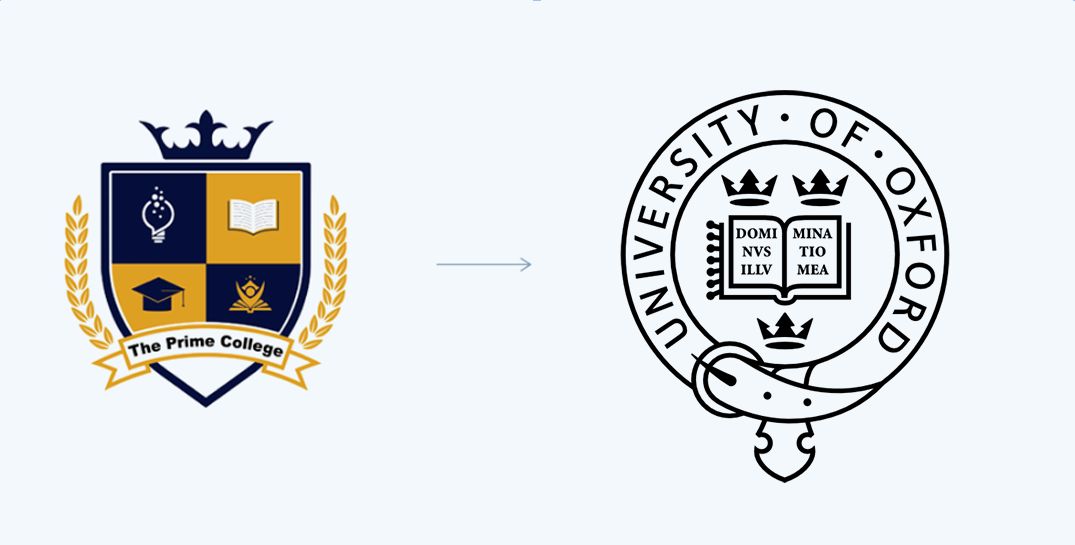
Our goal was to create a timeless and versatile identity that resonated with both current and prospective students. Drawing inspiration from prestigious institutions like Oxford, we envisioned a logo that embodied tradition and excellence while being contemporary and inviting.
The old logo next to the University of Oxford emblem we used as inspiration.
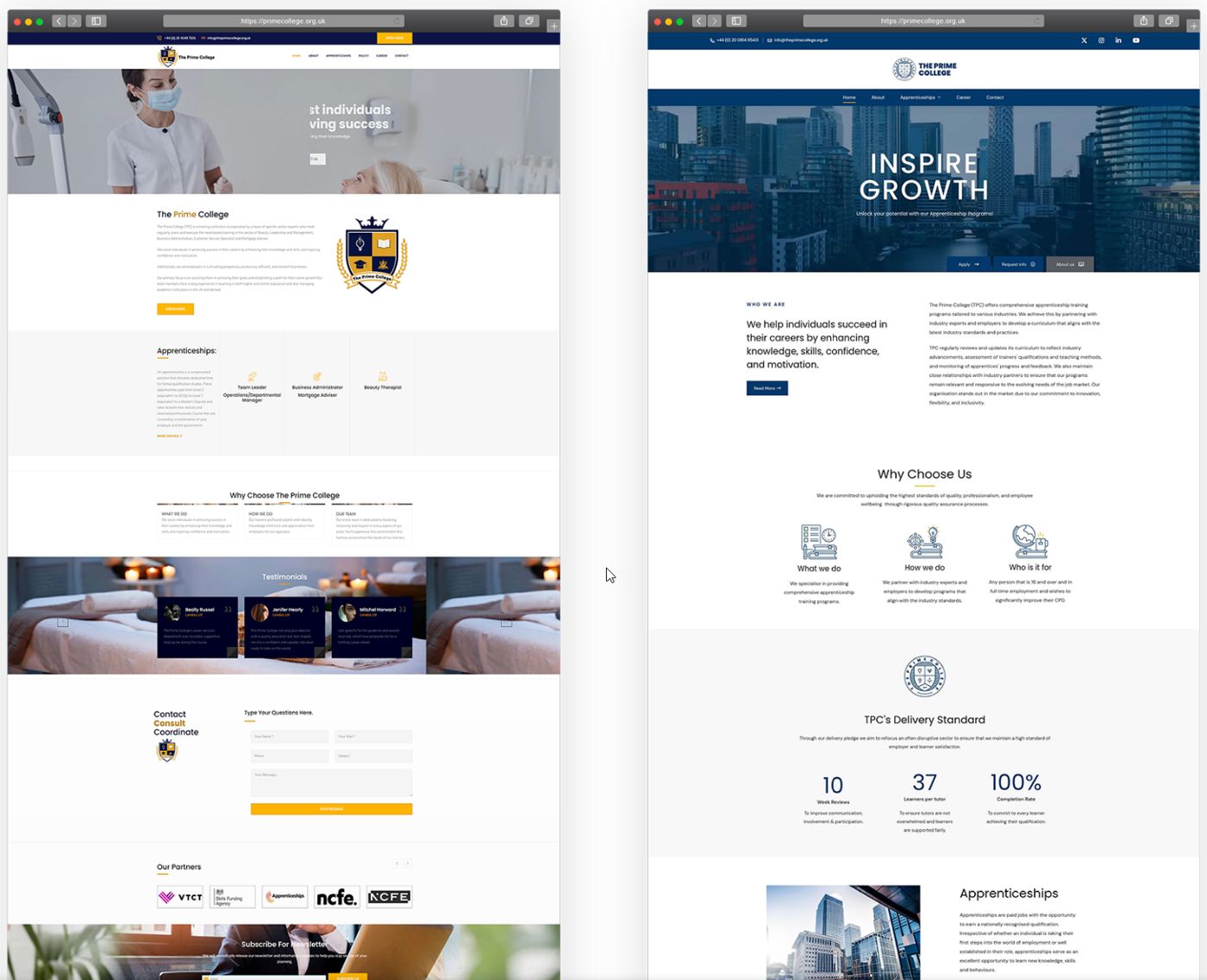
While working on the project we enhanced several functions and added a number of improvements, including the domain name: theprimecollege.org.uk became primecollege.org.uk.
The approach
Market positioning: we analyzed the current market positioning of Prime College and identified areas where the brand could stand out.
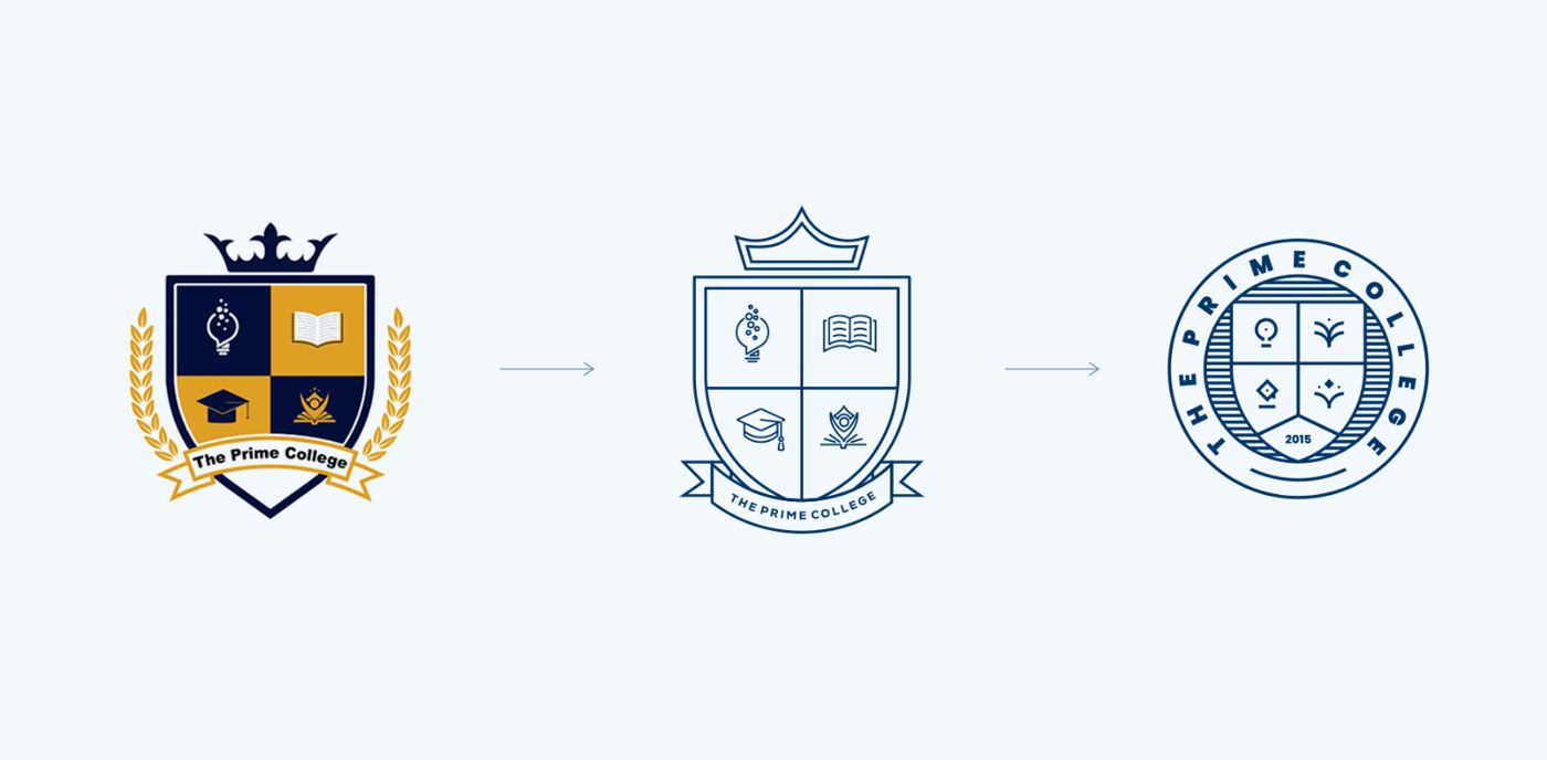
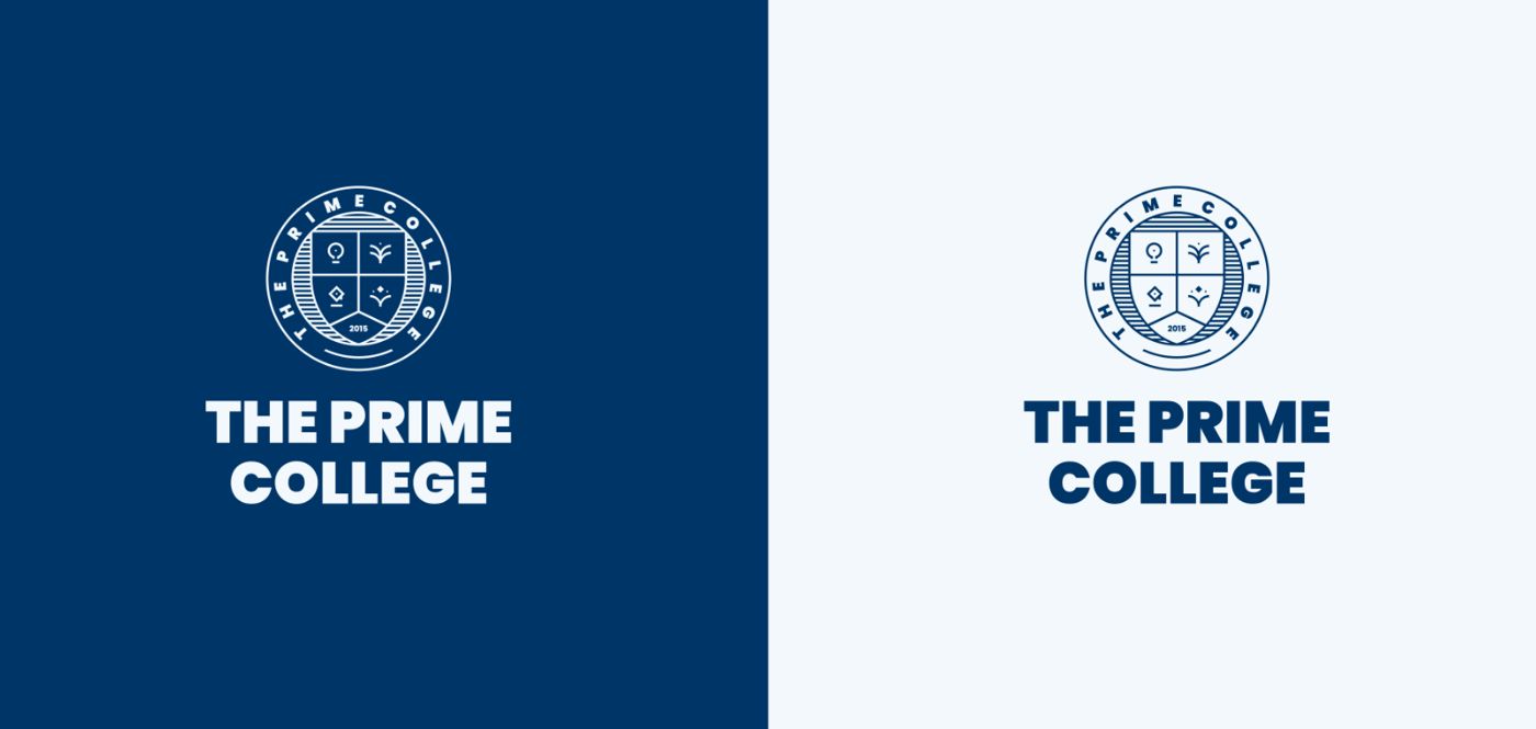
Logo redesign: we reviewed the original logo, focusing on simplifying the design to create a more symmetrical and timeless emblem, easily recognizable and adaptable for various applications, such as apparel and merchandise.
Color palette alignment: we selected a new color palette that aligned with Prime College's vision, ensuring consistency and modern appeal.
Inspiration: timeless academic icons, tradition and excellence in a contemporary, inviting form.
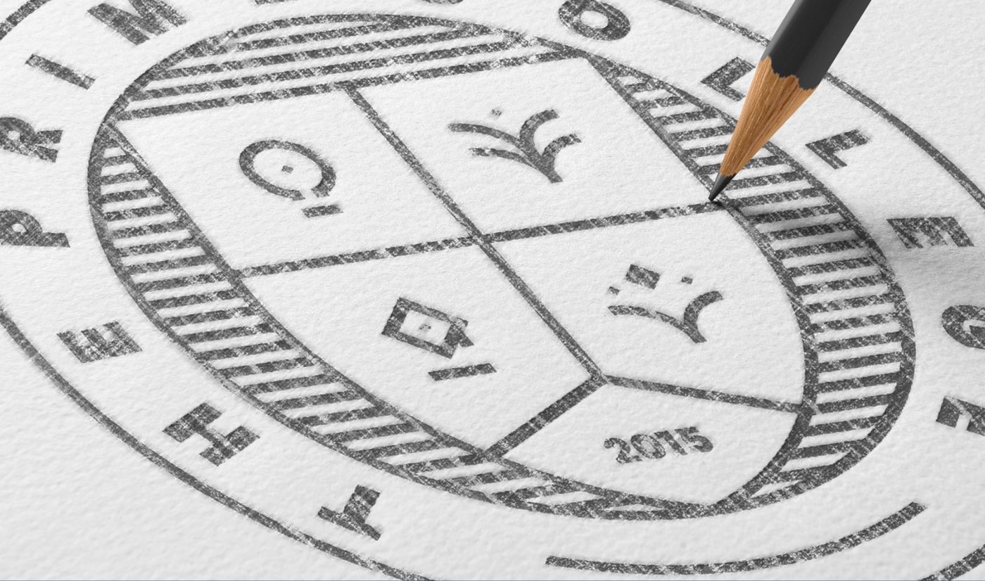
The transformation: old crest, simplified line emblem, final circular seal.The seal started on paper: pencil sketch of the new emblem.
The result
Old logo: a design that no longer reflected the college's dynamic and forward-thinking ethos.
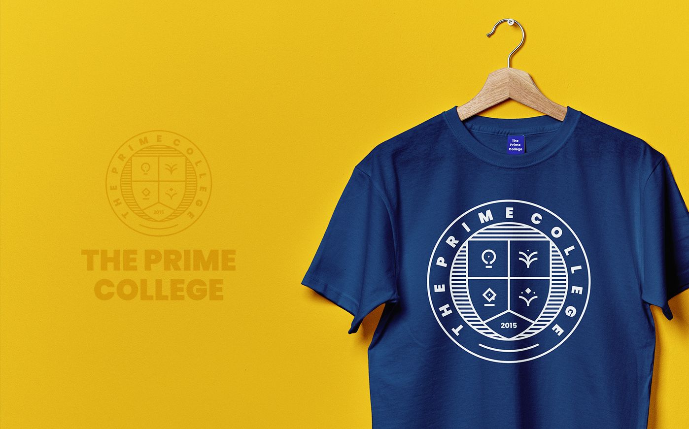
New vision: inspired by timeless academic icons, we crafted a logo that is not only symmetrical and elegant but also versatile enough to be proudly displayed on student merchandise.
End result: the new branding positions Prime College as a leader in education, with a modern and timeless identity that students and staff can proudly embrace.
The final logo, working equally well on navy and light backgrounds.The website, before and after: from the old layout to the new brand on primecollege.org.uk.
One identity, everywhere
By rebranding Prime College, we have helped create a cohesive and compelling visual identity that supports their mission and enhances their market presence. This new brand identity is a testament to the college's commitment to excellence and its bright future.
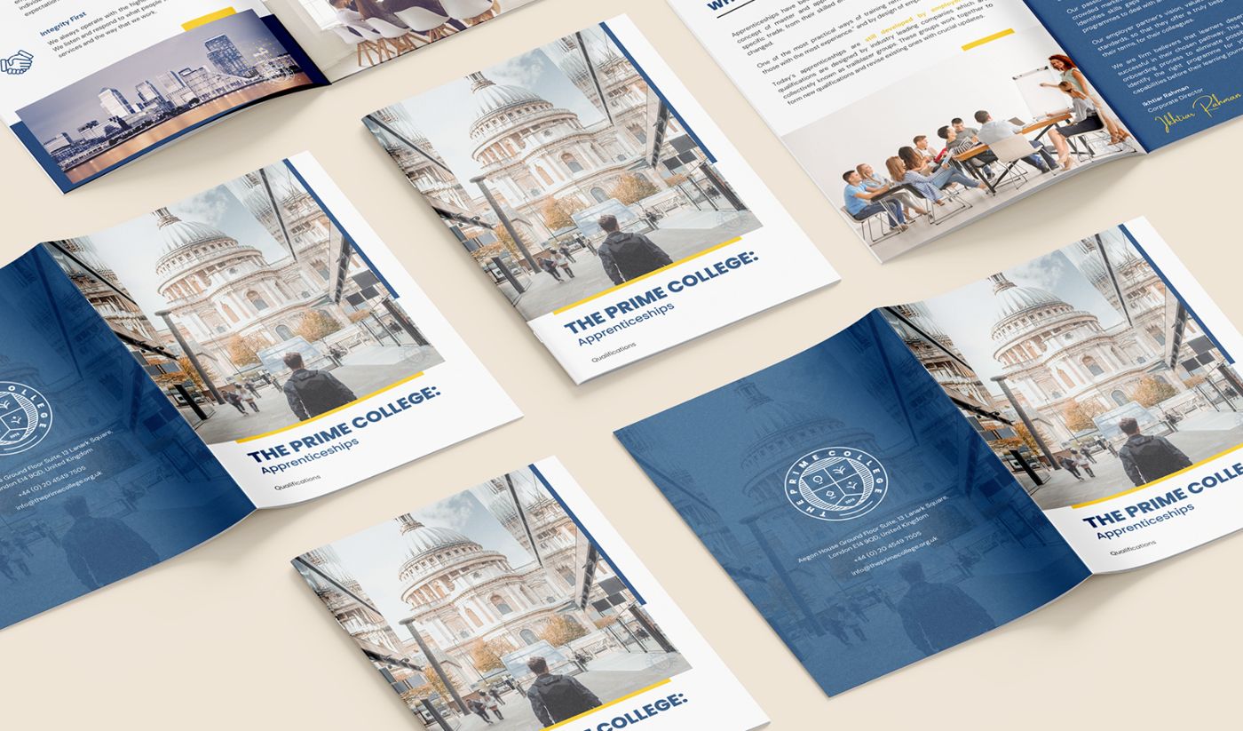
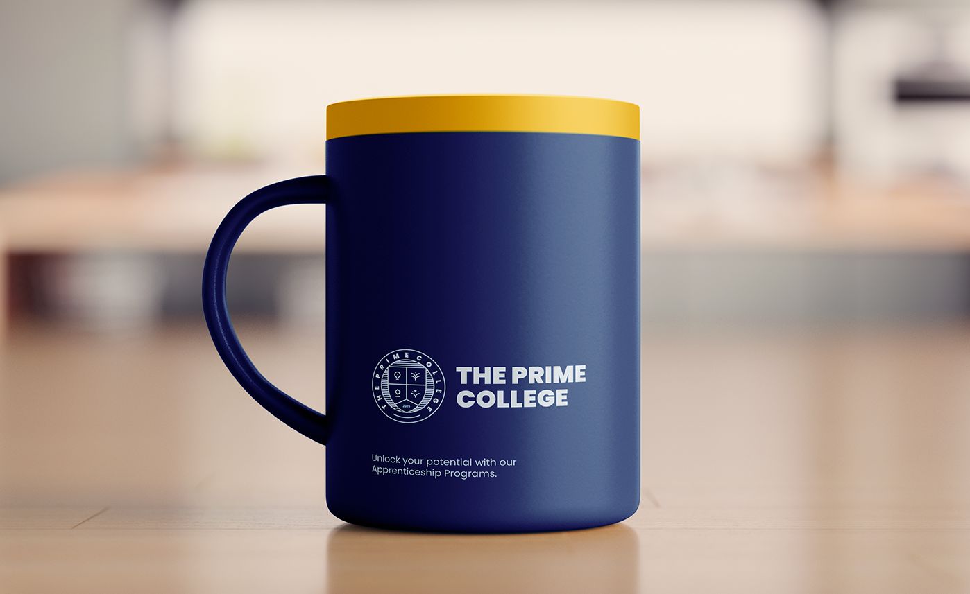
Apprenticeships brochures carrying the new identity.Merchandise ready: the seal on student apparel.Down to the details: branded mug with the new identity.
See the brand live
The new identity is in use today across the college's website and materials.